Is it a common opinion that these signs are ugly? I certainly don't consider them aesthetically pleasing, but they are so ubiquitous, functional, and necessary that it never even crossed my mind to think of them as either ugly or attractive, in the same way that I've never pondered the aesthetic merits of stop signs.
I think "ugly" is just a clickbait opinion at the top to get people to read a (quite interesting) discussion of the history and sociology of illuminated signs.
We're still at the stage of LEDs imitating existing lighting design, rather than having their own sui generis aesthetic. You get LED bulbs that fit existing fixtures, with the heat-sensitive short-lived driver electronics packed up against the hot LEDs, and a very different light pattern to the bulb they're replacing.
I've been impressed with the availability of cheap "warm white" LEDs, and I'm on the point of trying to design my own lighting fixtures out of aluminium.
What's really amusing is that a previous generation of art critics had exactly the same complaints about the "spectacularly flexible and inarguably lovely" neon signs that this guy likes.
The business owner just cares about letting people know whether or not the store is open. He's not out to give the customer a transcendent esthetic experience.
"It works" and "it doesn't cost much money" are really the only criteria here. The neon signs were free/cheap because they generally also served as brand advertising. The LED signs are just plain cheap. Both serve their necessary function.
> What's really amusing is that a previous generation of art critics had exactly the same complaints about the "spectacularly flexible and inarguably lovely" neon signs that this guy likes.
Is that really true though? Neon can be beautiful, e.g. see Dan Flavin. LEDs can be beautiful too, e.g. Leo Villareal. It's not about the medium, it's about the execution.
Maybe it's not a big deal in the scheme of things, but cities are hostile enough as is. It's the little things that can add up to making a place pleasant to live and work in or not...
The practical, utilitarian present is always hideous. The romantic imagined past is always beautiful. That's why today there's more dignity in being a burlesque performer than a regular stripper. And why Gibson wrote Neuromancer on a manual typewriter and avoided touching computers until they became so ubiquitous he couldn't not touch one.
Many journalists and authors still swear by WordStar -- among them George R.R. Martin. 1980s word processing was in some ways more straightforward than the Word of today.
I think it's like the plumage of the male peacock. It doesn't make sense at all to put on that display, but if everyone does it you can't be the only one out, because it's expected.
Here in old-timey Europe I know only one shop that has an open sign like that, and it's a massage parlor.
Here in old-old-timey Europe (London), these signs (and others like the green cross on pharmacies) are an increasing scourge approaching epidemic proportions. Never mind street lights - shop signs are ruining the night skies.
Apparently there was an aurora borealis visible over Europe few nights ago, but I couldn't see it because it was outshined by the city's aurora commercialis.
A hard choice between something that is more correct and something that is more recognizable to a person who (like myself) doesn't know latin very well ;).
They are definitely not a gem of art, but it never occurred for me that LED signs are ugly. They are functional and energy efficient, that's all what's needed of a sign. Though as other commenter have mentioned, "open" signs are not very popular in some (most?) European countries.
But stop signs are designed according to international conventions (that's why they look the same in almost every country). Open signs are not. In fact, they are notoriously uncommon here (Denmark).
I think it depends on the context - they can certainly make their surroundings horrible (cf Piccadilly Circus, London) and I'd classify that as "ugly". Although I generally don't like LED signs anyway because they tend to be ungodly bright and I have enough trouble with dark-sight as it is.
To that point, someone should consider the design effectiveness of road signage, just as much as someone should maybe design an "OPEN" sign that isn't "ugly" but also get's the message across, while also having potential for becoming iconic.
Tangential story: I live in Norway where neon signs are basically unknown (or at least, were back then). When I was a kid and visited the continent for the first time, I recall being struck by how common neon signs were, even in "serious" establishments like drug stores. At the time, already the pretentious aesthete, I quickly decided that the popularity of neon signs on the continent was a sign of poor taste.
After reading this article, I wonder why these kinds of differences between countries exist. In Norway it would almost be gauche to open a brick-and-mortar business without first hiring a designer to create your visual expression, but other countries seem to like neon signs (and the like) better or alternatively just don't care as much about the visual design of a store's sign.
"At the time, already the pretentious aesthete, I quickly decided that the popularity of neon signs on the continent was a sign of poor taste."
Yeah, in the original article this line really lost me:
"Neon is spectacularly flexible and inarguably lovely."
And I just had to bail out with a big ol' BS light flashing in my head. This same person writing at the time when neon would have come out would have bitched about them then. And in 30 years when flashing holograms are telling us that shops are open, he'll be writing a paean to how wonderful LED lights were...
"They were so physical... you could touch them. Someone had to care enough to hang them up, and find a place on the wall where they fit. They had that irreducibly human touch that let you know a real person had been there, caring, pinning his or her hopes for the success of their business on this sign, this physical object. It humbling to consider what hopes resided in this fragile arrangement of real atoms, instead of mere ethereal light."
Can I know that for certain about this specific person? OK, no, not really, but tell me it's not a really good guess.
I think you may be underestimating the amount of neon signs in Norway!
It's no longer being used very much, but I can think of tons of signs in Oslo and in the industrial parks in the Oslo suburbs such as Lysaker and Sandvika, going back to the 1980s and up to recently and even today. You must have been to Karl Johans gate and Stortingsgata in Oslo? For many years had quite a lot of neon signs [1]. The big blue neon Aftenposten logo is still there [2], I believe, as is the old Freia logo above Egertorget [3]. Cinemas like Saga, Colosseum and Eldorado had neon logos until just a few years ago. Peppes pizza is another one. Tons of neon.
Small neon signs in shop windows (like beer or soda ads) like you often see in the U.S. are/were very uncommon, however. But those tacky animated LED "we're open" signs? Those are everywhere.
Finally, is neon itself tacky? I don't think it is at all [4].
Maybe the grandparent is talking about the illuminated open sign (since that's what the article is about), which from what I've seen of it is comparatively rare in Europe. I certainly wouldn't have described it as "ubiquitous, functional, and necessary", as baddox did in another comment to this HN story.
I think that's largely attributed to differences in consumer/commercial culture between Europe & the US. In the US, it's entirely likely you might find shops and restaurants in a strip mall that have closing times varying by as much as several hours (a book store might close at 6pm, but the restaurant next to it is open until 10pm, and the hair salon next to that is open until 9pm). Being able to quickly glance and see what's open is a huge benefit.
I'm from Germany and when I went south for holiday the neon/led lights for drug stores also threw me off. They give off a feel of untrustworthiness to me.
Ya, the worst i've seen is huge flashing (like, stroboscopically, i kid you not) green crosses for drug stores here in France... There are a few traffic intersections where, after having lived here a few years, i still regularly confuse a far-off (3 blocks) green pharmacy sign with a green traffic light that applies to me. Apart from being highly fugly, i would venture that it's almost dangerously distracting. It seems pharmacies in particular are offenders in my city, the rest is all rather subdued (luckily).
Hah, I just came here specifically to comment about this. As an American tourist, the popularity of those garishly animated pharmacie signs in Paris was one of the subtly weirdest things about a number of countries in Europe that I've visited. I didn't see them anywhere outside of France, and they were so bright and distracting that I seriously wondered how they weren't a traffic hazard.
> After reading this article, I wonder why these kinds of differences between countries exist.
The US has high per-capita income (lower than Norway, but not by much), but that average hides a lot of income disparity. This percolates to other disciplines as well; lots of highly educated people but also a large disinterested population; plenty of artistic talent but also a majority which is not able to fully appreciate aesthetics.
Some level of homogeneity (which is the true form of equality) is perhaps a characteristic of sophisticated future societies.
Norway is homogenous in part because it's small. Its population is a touch larger than Alabama's.
I imagine it's easy to be homogenous when you're small with a low immigrant population. I'm not sure it's because they are more sophisticated than other countries.
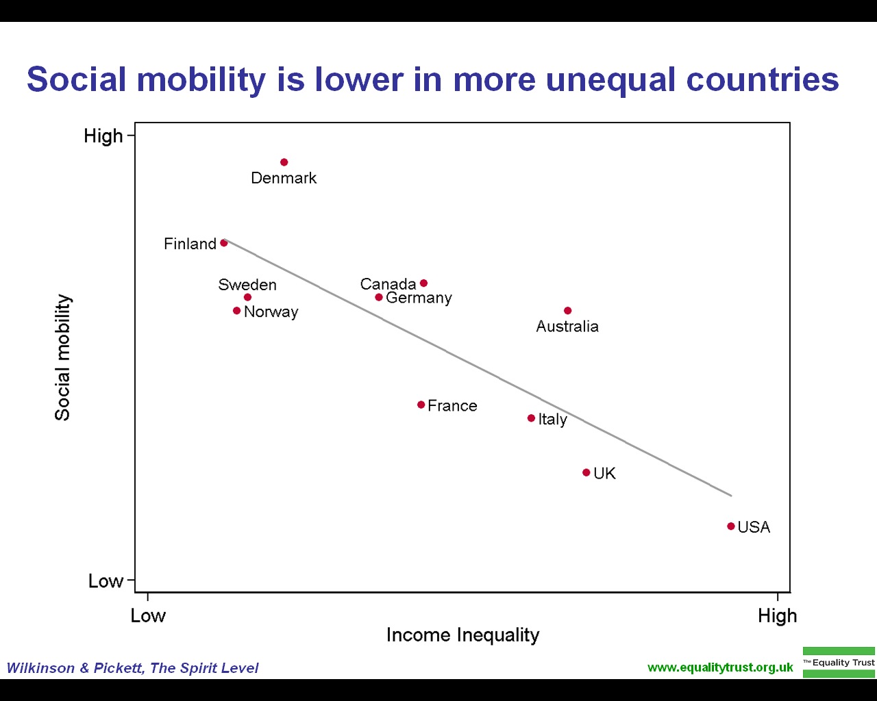
Isn't the relationship in the graph simply the result of how income inequality and social mobility are defined? The lower the income inequality the less you need to earn (relative to the baseline income) to move up the social ladder (defined in terms of income).
I guess you've forgotten about all the signs on the building by the National Theater T-bane entrance. The Freia logo right by parliament is LED, but it's still a good example of that type of advertising.
But I certainly don't think it's anything close to gauche to open a store here without hiring a designer. That said, I do see more offices hiring them, but that's not just Norway, it's all over.
"Because LEDs are essentially microchips, they can be programmed."
This is incorrect. The die process size (and chemistry) used for making LEDs would make absolutely terrible microchips. All programmable signs have separate control chips.
LEDs at 4 V DC are probably much easier to control with "microchips", which operate at a similar voltage, than neon at 2-15 KV AC. I agree he worded it badly, but the conclusion still makes sense for a loose reading of "essentially".
Plus, the RGB LED pictured in the article can be "programmed" in the sense that the colour can be defined on the fly, and isn't bound to the bulb colour defined in the original design.
You're reminding me of the electric light signage, based on incandescent bulbs, of the 1970s found in some older downtown areas. Effects such as "running" lights, etc., which judging by the racket they made were operated by electromechanical relays, and you could quite clearly hear them as they operated.
I'm quite aware. LED normally refers to the packaged die, not the die itself when people are talking about it like this. Having the controller inside makes absolute sense, the alternative is running hundreds of rows of PWM from your driver chips out everywhere.
Different things seem cool to different people. In particular, different things seem cool depending on your social class, especially depending on which social class you want to signal membership in/which social classes you think you could be mistaken for and want to disclaim membership in. I bet you don't think gold-colored iPhone cases with fake jewels on them look particularly cool either.
Moreover, even things that look cool to different people can look cool in different contexts.
A traditional neon "Open" sign might look horrible contrasted against the sleek interior of an Apple store, or Crate and Barrel, but could well be perfectly appropriate and hip at a Johnny Rockets.
What's funny is that I have come across small shopping places, not quite large enough to be called centers, which only allow the old-style carved in wood, probably with a precision router, but non the less, only visible with the aid of daylight and at night focused lights. Depending on lighting conditions, and the contrast, they can be hard to read.
That appears to signal 'upscale' and cachet, I guess, as I have mostly seen it in tony areas.
As for LED vs Neon, I think it all depends on the design and how well it fits in to the design of the rest of the business.
If it's simply for utilitarian purposes, like say a dry cleaner's, all you need to know is that they are open or closed. Aesthetics, don't come much into play, except for the new 'green' dry cleaning, so i suppose LEDs would reflect conservation a little better.
Anyhow, I think one's preference for signage depends on your exposure. If Neon signs remind you of Bail Bonds, dodgy motels and other peripheral businesses, you'll probably think they are tacky. If instead they recall a great BBQ joint or sushi bar, you probably have a favorable view of them. Same for the other signage technologies.
The ones most people buy from Sam's club [1] look a lot better than the samples he shows in the article (and look better in real life than on the Sam's Club site). I had one of these in my store, and the fake neon actually looked pretty good. And it had the handy feature of telling customers when the store was open.
While the article was focused on why LEDs are bad, it did briefly touch on the history of signage but missed an important point: The masses were until relatively recently illiterate, and a sign had much power.
"Where shall we meet?" "The White Swan." Which could be identified by a picture of a while swan hanging outside.
I can't help but feel signage still achieves these purposes of association (which the author also touched on, but didn't elaborate on): A tacky neon sign can be recognized instantly from 100 meters or more: size, colours, rough silhouette, instant recognition of what it means, an assurance of the level of quality (i.e. average, run-of-the-mill, but probably good enough).
In my town someone has gone up and down the main road selling variously-colored LED light strips, and many businesses have used them to outline their windows, doors, trees, fences, etc. In many places, the LEDs are so bright you can barely see the name of the business at night -- which often is non-illuminated.
> The light coming from EL Wire has varying intensities depending on the type and thickness you buy. They do not compete with traditional neons in terms of intensity though. But you're getting a compromise for an easy do-it-at-home alternative. All EL wires naturally slowly degrade in UV light, but they're just fine for most purposes. If you need extra UV protecion, coolneon.com's "Phat" wire have extra UV protection, so they could work indoors or out (but you probably should keep it away from bright sun anyway).
I did, while reading the original post, had to wonder: why don't more signs use LEDs to light up coloured plastic from behind? It might look nicer... But it might also end up costing more, so perhaps I have my answer. And of course, this is all assuming you want a tacky open sign instead of something more useful, or redesigning a storefront to more clearly indicate if you're open or not. I hate when people forget to turn off the open signs.
Very interesting, thanks! I had seen el wire before but only in the context of building suits like those from Tron Legacy. I was hoping there was a way I could put a line of cool clue around my bass cabinet for cool soft blueness.
The article mentions Wade Swormstedt and the Swormstedt family's background in signs. Tod Swormstedt founded a sign museum in Cincinnati, OH (http://www.americansignmuseum.org/). If you're at all into the history of signs and placards you'll really enjoy visiting it.
I'm not into the history of signs or placards at all, and I still thought that museum was superb. I took the guided tour with Tod himself. His enthusiasm for signage made the whole thing all the more interesting.
So an outdated technology was replaced by a cheaper solution that served the exact same purpose. Sounds like we should be cheering for the the LED signs.
Neon signs are confusing during day. They are not bright enough in bright sunlight. You have to look closely to see if they are on or off.
Flip boards seem very practical and do their job well in day or night. I see purpose in having name of the shop done in neon as it's the brand name. Don't see why Open signs should also be in neon. Initially, I thought thats what the article was about.
He chooses a walking route through an area with historical significance, and gets a group of people to walk it. The main one is downtown LA to Griffith observatory, which gets several hundred people, but he has done other one-offs. From the description:
"The Big Parade is a two-day walk in Los Angeles. It includes about 80 public stairways over 35 miles, from downtown to the Griffith Observatory. The walk runs on a timetable, and is designed as a series of attached loops, so that people can come and go as they please - join us for a mile, an hour, or an epic."
What's with the disgusting "Are you human? Recommend this story." bullshit at the bottom? Are they implying that only robots would read it and not be grateful enough for the wisdom imparted upon them to recommend?
The "open" signs provided beer or soda makers were uglier. The LED open sign just kind of mediocre.
America has always been a rather ugly place. The many wretched, tasteless signs hanging on liquor stores provided by the nastiest sugar, tobacco and alcohol interests have overall been the capstones of this typically American ugliness. Anything is better than these. Not classy or nice looking but not quite as terrible.
Yeah, I might have to agree that American art and beauty might not best be showcased at liquor stores but lets not use that brush to paint the rest of the country.
Funny how tastes differ. I certainly wouldn’t disagree that the US has great architecture (such a rich, diverse, and big place is practically guaranteed to have that), though the examples you picked seem like the blandest bombast ever to me. All interesting and even fascinating buildings, certainly, though not something I find aesthetically pleasing.