I have always hated it when an occasional book (english language) puts the title on the spine the other way. I wonder why that happens. I've never considered that in other languages it might be normal to do it the other way. I wonder if books which have the title on the spine the other way are more likely to be translations?
Most of my paper book are in my office or in boxes so I can't check right now.
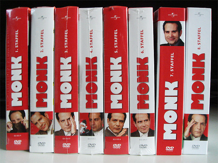
That's actually two different sets from two different countries mixed together to achieve that. If you do a product search and look at the images, you'll see what the set is really supposed to look like, and it's not that.
I think it depends more on which country they were printed in / preference of the publisher. I have a multi-lingual book and some printings of it have a European spine, others a Western spine.
It's easier to find books by title on the shelves of a French bookstore or library than an English/American one. The titles are justified evenly with the shelving. So you can scan along the shelf looking for your title once you are in the right section. With the English system, the title text starts at a different level, the height of the book. It is less efficient to scan.
Nope, because bottom-to-top all titles start roughly at the same height (the bottom of the spine), while top-to-bottom they start higher on higher books.
Because the words wouldn't start at the same height. The point was that, if every title starts at the same height it's easier to skim, because you don't have to move your eyes much when looking at the first few letters.
So make them all start at the same height, at the top of the spine? What exactly about top-to-bottom orientation do you think precludes proper justification? You're still on about something orthogonal, the justification along the spine, which isn't affected by the overall orientation.
Also, someone posted photos of French bookshelves showing that their centers tend to be centered like ours are, so it's not any more readable. If you think of the spines as advertisements on bookstore shelves then this makes sense.
There is at least one other distinction of French books, especially in the anthropology domain: They are almost ALWAYS WHITE!
Spines schmines. A friend of mine is a French anthropology buff and his library is white, shelf on shelf of whiteness, titles all in this wild direction. It's madness!!
It's fascinating to see what small nudges, path-dependency, local tradition, and merging cultures do to conventions and practices.
On another book-related topic: I've been trying to sort out when Library of Congress details started appearing on the Title Page verso of American books. Seems to be between the 1940s and early 1960s, though the practice wasn't unversal even by the 1970s (sampling from books around the office).
ISBN (and its precursor SBN) are late 1960s.
(I've become a cataloging / classifications geek.)
The LOC CIP program, which gives publishers cataloging information in advance of publication, began in 1971. Before then, I don't think it was usual for publishers to have more than a catalog card number.
The CIP program mainly exists to make it easier for libraries to acquire and catalog books. LOC still requires that the data be printed in the book, even though most libraries now not surprisingly get the information online, either directly from LOC or from a service like OCLC.
True, when a book is put flat with the front cover up, a bottom-to-top spine title is now upside down, whereas a top-to-bottom title is now upright and perfectly readable
If you're actually writing the title onto the spine manually with a pen and holding the book right-side-up, top-to-bottom becomes the natural consequence. I wonder if that may have been a factor in creating the top-to-bottom direction.
I could imagine machine printing of dust jackets lead to the opposite convention. If you are printing a dust jacket, the back of the book is on the left, the front is on the right, and the title is in the middle. Despite reading order being from left to right, people tend to both proof and layout the most 'important' information first. This would be the title page.
Once you've laid of the title, the next thing you are going to move to is the spine. A title printed on a book spine from top-to-bottom would be completely upside down from the perspective of the front cover, whereas a title printed from bottom to top would only be 90 degrees off from the front cover. Thus the layout and proofing of the spine would be more "natural".
I wonder if there was some sort of technology invented between the widespread adoption of the printing press in Europe, and the adoption of the printing press in the colonies that made the bottom to top layout less obvious. Maybe the colonists were too uncultured to use dust jackets.
Edit: I just checked, and I was surprised to learn that every single tilted title goes the same way on my books. I have a lot of old books that I bought at used bookstores just because they looked interesting. Regardless of the binding, age, or field the book was published in, if the title is tilted it goes from top-to-bottom. Fascinating.
I did discover some of my books were upside down though.
Printed dust jackets as we have them today didn't really exist in colonial times; they're basically a 20th-century innovation. As the article points out, the early convention was for titles to be stamped horizontally. The title would have been stamped on the binding, and a plain paper wrapper covered it for protection.
I'm always surprised at publishers who print the title on the spine in a difficult-to-read font/color/size. Don't they want people to be able to find their books?
The same for CD publishers. When I'm looking through a stack of CDs, I want to know the artist and album title. These are hard to find on many CDs, some even cleverly omit one or both entirely!
I don't know anything about this, specifically. But for consideration:
You know those ads that puzzle you and leave you examining them, trying to understand what they're saying? They've just grabbed a chunk of your attention.
(And a lot of ads, these days, are designed to leave a memory of the product, preferably associated with an emotion, lodged in your sub-conscious. Not to sell you outright, but to be there, lending familiarity, when you are at the point of selection and purchase.)
Anyway, I wonder whether the difficult to read spines are more noticeable and so grab desired attention in certain contexts.
It doesn't really matter when physical media is no longer required or desired. Books, DVDs. CDs and such like are going the way of LP records - quaint, for gifts and decorative purposes. In this brave new world it is how good the gift-item looks on the covfefe table that matters. Even then the book will be migrated out to storage and the charity shop in due course as nobody has space for clutter these days.
What I am disappointed with is how we used to have mostly Penguin Books and their imprints, all with uniform and good looking spines. A wall full of Penguin Books looked awesome. But then we moved to this 'pile em high' retail model where the designers took over the cover designs to jazz them up and make them the bestsellers we know today.
I don't understand why you couldn't just put a book upside down on the shelf if you want its spine print to face the same way as books that are printed the other way around. "Don't worry, the letters won't fall out."
Likewise, if it's so important that the spines can be read for a stack of books in a store, turn all of them to their face except for the top one... oh, yes, and hope that no-one buys the top one or else someone needs to keep flipping the new top of the stack.
I'd wager that many people (such as me) think it feels "wrong" when the book is upside down. This is especially true if the spine has some sort of artwork.
At high school and uni whenever I carved my name with pen into the page edges of my newly bought textbooks on the first day of term to dissuade book thiefs, I always held the book face up while doing so. It would have felt unnatural to hold the book upside down while performing this sacred rite.
the french system looks bad when the volume is laid on a table, but has another advantage: in multi-volume sets, the numbers on the spine read in the natural sequence, left to right and top to bottom.
By the way in Italy, in our usual anarchy, both systems are in use :-)
If you lay a book with the front cover facing up, the top to bottom printing will be right side up.
If you lay the book with the printing bottom to top, the binding print will be right-side up, but, assuming a right handed person grabs the book with their left hand, and turns it as one would so they can open it and turn the pages with their right hand, then its a natural movement - pull the book with the left hand, turn to face you, open and flip through with the right hand...
I hate my bookshelves. They are really ugly... a collection of mismatched colors, styles fonts.
I would pay for a service that would print out new spine stickers for all my books that cover the existing spines and create a consistent look for all of them.
Bonus points for an app that I just use to take a picture of my existing shelf and it figures out the rest.
Interesting. For me, I use the color and font and size of the book to rapidly find it rather than having to actually stare at every book and look at the title... standardizing all books would make them much more difficult for me to rapidly find.
All my Chinese and Japanese books have the spine text going vertically down. Some have English text mixed in though, which is (horizontally) downwards. I can't imagine a book with French text mixed in (horizontally) upwards with the Chinese (vertically) downwards text would look very natural.
Seems like they're might be something akin to spontaneous symmetry breaking when a sufficient quantity of books choose one convention over the other, by random chance. The rest of the publishers would just suddenly fall in line.
Everything in this article was obvious. You don't need to reference Cultural Attractor Theory, whatever that is. Anyone who's noticed the foreign books section in a bookstore and has common sense has deduced the explanation.



/about/88006976-56a2e49d3df78cf7727b0095.jpg)
Most of my paper book are in my office or in boxes so I can't check right now.